
Nobody asked for this. That's the point.
Minnesota has a brand problem. Not an identity problem — it knows exactly who it is. Fiercely progressive, genuinely diverse, colder than you expect and warmer than you'd believe. Home of Prince, the greatest State Fair in the galaxy, 11,842 lakes, and the longest Democratic presidential voting streak in the country. The problem isn't the state. The problem is the brand hasn't caught up.
This is the rebrand that fixes that. Every piece of it — strategy, identity, motion, copy — built by one person, with a little help from some very good AI tools.
Minnesota didn't need a new identity. It needed someone to hold up a mirror.
ROLE
Unsolicited Brand Strategist & Designer
RESPONSIBILITIES
Brand Audit & Competitive Analysis
Positioning & Strategy
Visual Identity
Mockups & Brand Expression
Speculative Brand Guide
Motion & Video
TOOLS
Figma
Illustrator
Photoshop
After Effects
Midjourney
Gemini
Suno
Veo
Claude
ChatGPT
Framer
ONE: BRAND AUDIT
Minnesota's brand isn't altogether embarrassing. It's incoherent — which is actually a more interesting problem.
The pieces exist. A bold new flag. A wordmark with some character. Photography that actually captures the place. The problem isn't the ingredients — it's that none of them have ever been in a room together. Every touchpoint was designed in a different decade by someone who had never met the other someones. The result is a system that cannot pick itself out of a lineup.
That's the visual identity problem. The messaging problem runs deeper. When a state hasn't deliberately told its own story, the internet tells it instead — in memes, in movie posters, in "doncha know" impressions. Minnesota gets reduced to cold weather, hot dish, and a Coen Brothers film that isn't even set here. Meanwhile the actual Minnesota — the one that fed its schoolkids, protected reproductive rights, welcomed everyone, and hasn't voted red since Nixon — goes largely unannounced.
Both tracks need fixing. That's what this rebrand is for.


License Plates
Wrong number, clip art energy, and a URL. Has not made a decision since 1950.
Logo + Wordmark
A genuinely interesting mixed-case wordmark held hostage by a highlighter-green logomark and a palette that lists black as a brand color.
Tourism Positioning
The tagline says "Explore Minnesota" (come on guys, that's the best you've got?) The homepage says "Star of the North." Nobody told them they work for the same state.
State Flag
The best thing in the system. Designed last. Informed nothing.


TWO: COMPETITOR ANALYSIS
What Good (and So-So) Looks Like
Three states. Three different lessons. All of them better than "Explore Minnesota."
Every state in the country has a brand — some inherited, some intentional, most somewhere in between. Reviewing the full competitive landscape of all 49 states revealed a clear pattern: the states with strong brands aren't necessarily the most interesting states. They're the ones that made a decision and committed to it. Michigan committed to two words. Maryland committed to its flag. Illinois committed to a tagline that could hold an entire campaign. Three very different approaches. Three things Minnesota can learn from.

THREE: DISCOVERY
Forty-Six Taglines Walk Into a Room
Three things kept rising to the top. Not because they were the loudest, but because they were the most true.
I surveyed Minnesotans about what their state means to them. The answers fell into two camps: the clichés everyone expects — lakes, cold, hot dish, Minnesota Nice — and the stuff people said with genuine fire — progressive policy, community, the sense that this state actually shows up for its people. Both camps were right. Neither was a tagline.
So I got to work. Forty-six directions explored. Some brilliant. Some too hot for official use. Some killed in committee and buried with dignity. Here's what that process looked like.
FOUR: THE REBRAND
The Perfect Marriage
Something old. Something new. Something borrowed. Something blue.
The Mark


The Wordmarks


The License Plate


The Flag


Style Guide
The Type.
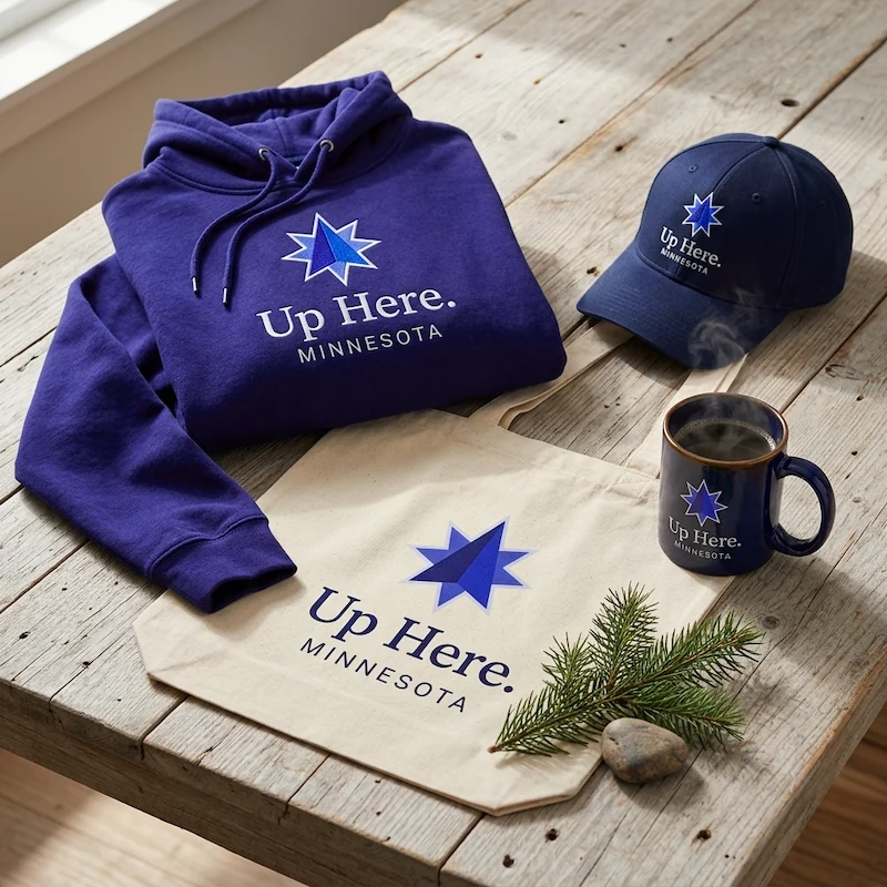
Brand Identity System
2026
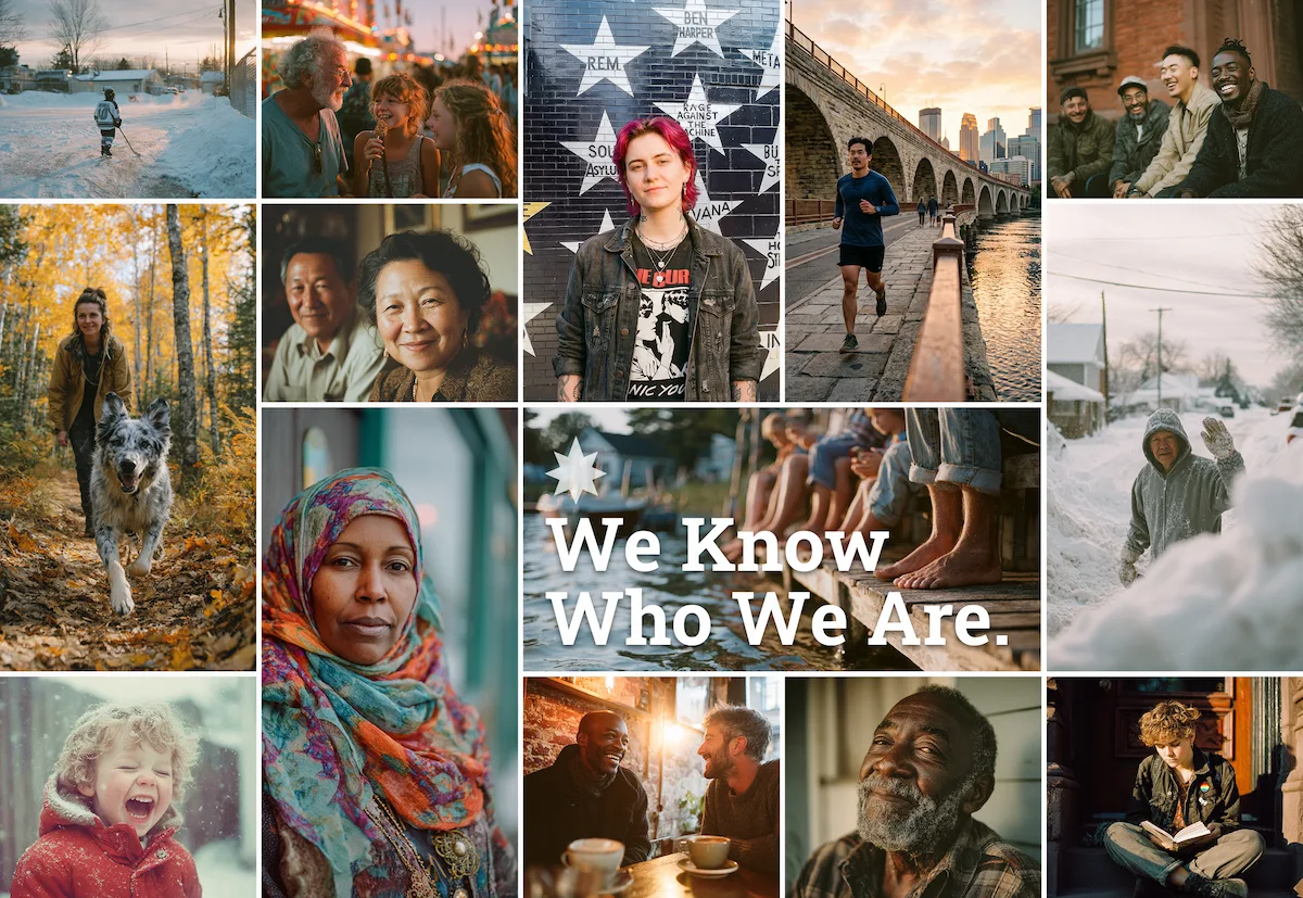
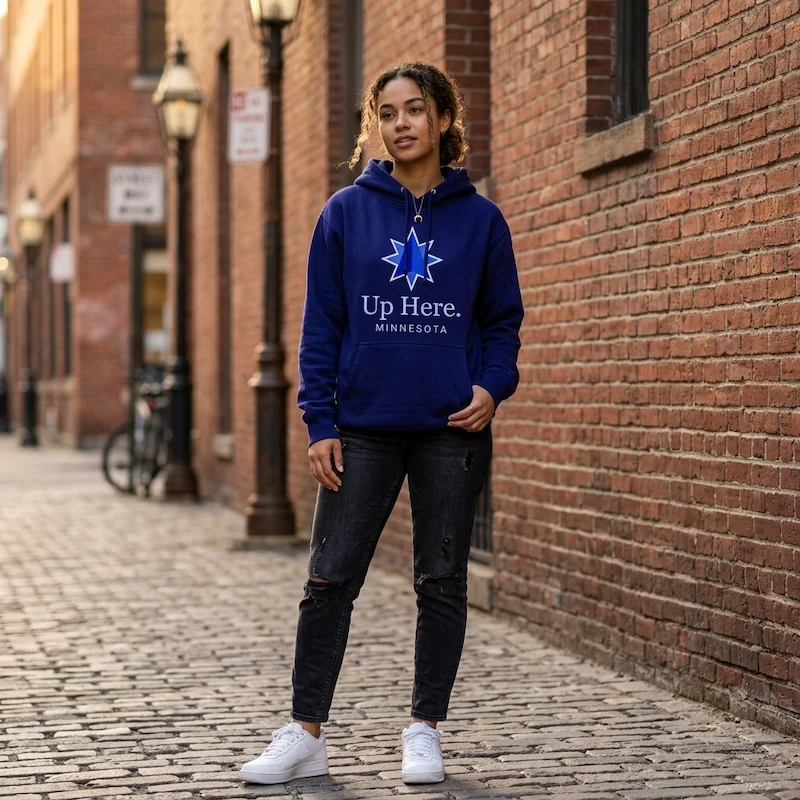
Who We Are.
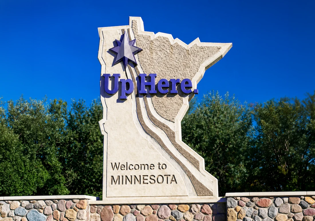
Up Here.
The Platform
We Know Who We Are.
It's not a slogan. It's a posture.
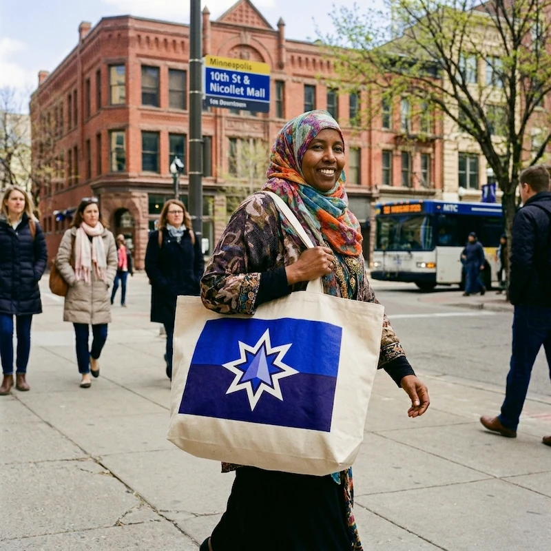
FIVE: THE BRAND IN CONTEXT
How it Behaves in the Wild
Turns out it works everywhere.
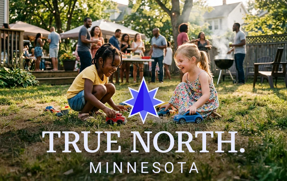
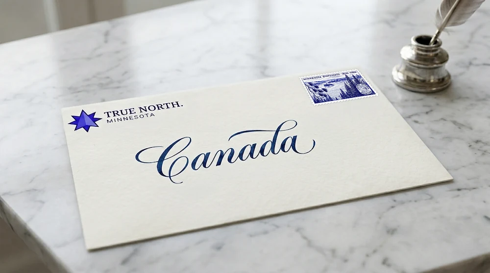
A brand system is only as good as what it does when it leaves the building. Strategy documents are fine. Style guides are necessary. But the real test is whether the thing holds up on a license plate at 70mph, on a tote bag on Nicollet Mall, on the side of a Bronco in a parking garage, on a laptop sticker in a coffee shop at 7am in February.
It does. The TRUE NORTH. mark scales from a favicon to a welcome sign without losing its meaning. The two blues work in embroidery, in print, in stone, in vinyl. The typography is as comfortable on a hoodie as it is in a brand guide. That's not an accident — it's what happens when a visual system is built around a real idea rather than an aesthetic preference.
This is Minnesota. Up here, we know exactly who we are. The brand just finally says so out loud.


SIX: REFLECTIONS (of water and sky)
What It Was Always Trying to Say
A translation, not an invention.
Minnesota didn't need a new identity. It needed someone to hold up a mirror. The brand was always here — in the name, in the flag, in the people, in the policies, in the 11,842 lakes nobody bothered to count correctly for 150 years. This project didn't invent anything. It just finally said clearly what was already true.
The Platform
We Know Who We Are.
Not a tagline. Not a campaign line. The thing underneath everything else — the answer to the question every brand decision has to answer. Does this feel true to who Minnesota actually is? If yes, proceed. If not, go back. Every color, every typeface, every mockup in this project reports to these five words.
The Bearing
TRUE NORTH.
Geography. Moral compass. The English translation of L'Étoile du Nord. The Dakota name for this land encoded in sky blue. The voting record since 1976. The direction every other decision points. Two words on a license plate doing the work of a brand strategy document. That's the goal. That's what it means when a brand is working.
The Tagline
Up Here.
The invitation. Wide enough to hold any ad, specific enough that only Minnesota can say it. Up here we have 11,842 lakes. Up here we feed our kids. Up here we've voted our conscience every four years since Nixon. Up here the water reflects the sky and the kids play dinosaurs in the backyard and everyone brings a dish to pass. Come see what's up here.
Oh, One Last Thing…

Texas, looking at you. (Everyone else is welcome too.)
